-
Alibaba Cloud SaaS Tool
Alibaba Cloud: B2B SaaS Tool for Computing & Domain Services

-
Sex education Toybox
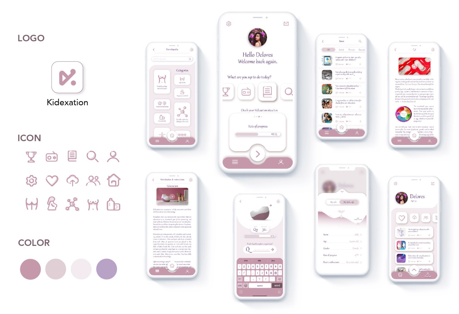
Kidexation – A Parent-Child Interactive ToyBox for Sexual Education with an App
Project time: March 2021 – May 2021 (Duration: 44 Days, 3 hours/day)
Individual project: All tasks are done by myself.
Keywords: product design, UX research, educational product, gamification, sustainable product, App design, Design system, parental teaching product, Parent-children interaction.
Target Audience: Parents with children aged 6 to 14.
Pain Points
In East Asian societies, the relationship between parents and children can often be subtle and complex, making certain topics difficult to address. Subjects like reproduction and sexuality are often associated with embarrassment and taboo. However, with the increasing frequency of child sexual abuse cases in recent years, some parents have started recognizing the importance of sexual education.
Despite this awareness, the deep-rooted influence of traditional East Asian culture still makes it challenging for parents to openly discuss sexual education with their children.
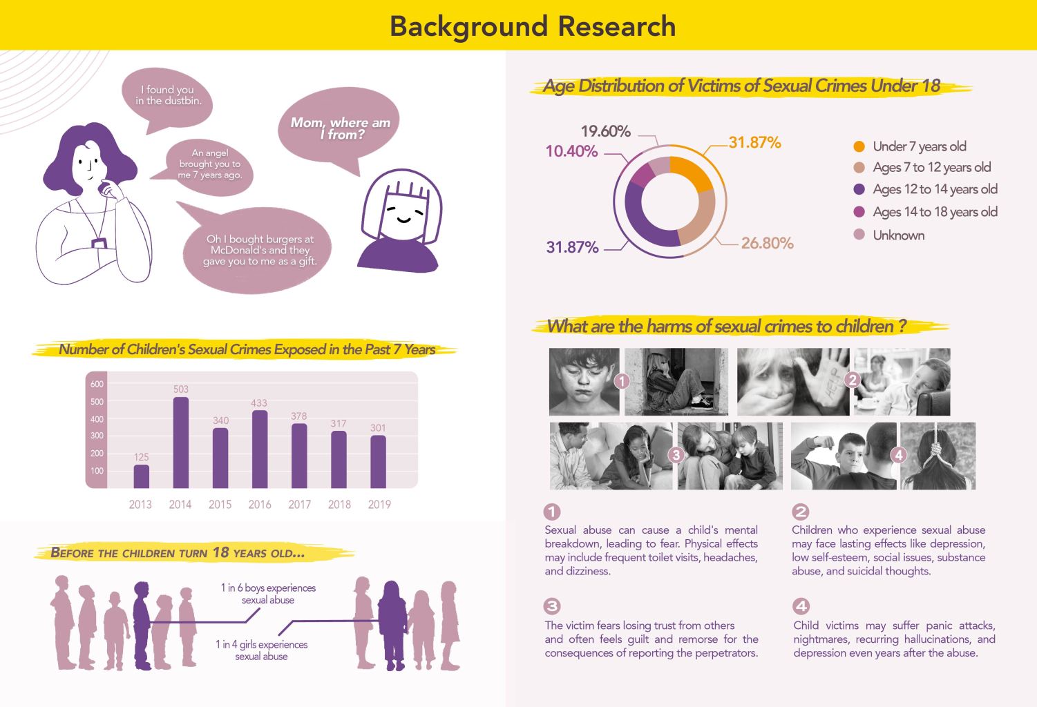
From the background research above, when we were young and asked our parents, “Where do I come from?” many would avoid the topic, giving answers like, “You were a gift from God.” This avoidance made the topic of sex feel forbidden, which only increased our curiosity.
Unfortunately, this often led teenagers to seek information from unhealthy sources like porn or other unprofessional materials. The lack of proper knowledge not only affects personal development but can also contribute to a rise in sexual crimes among teenagers, leaving many children vulnerable and hurt.
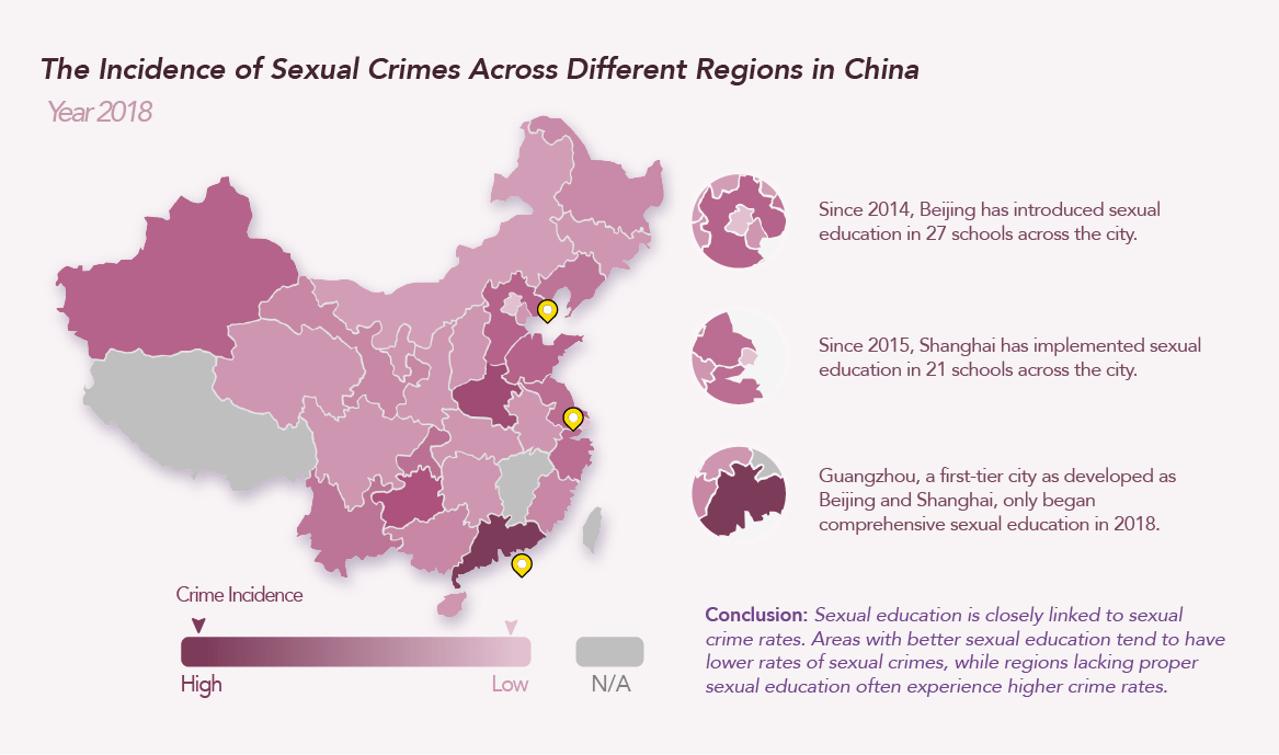
From the graphics above, it’s clear that in more developed areas of China, the crime incidence is relatively higher due to larger populations. However, regions that have implemented sexual education for K-12 students show significantly lower rates of sexual crimes. This highlights the long-term impact of sexual education—students who received proper education 5 to 10 years ago are better equipped to protect themselves and are less likely to harm others or become offenders.
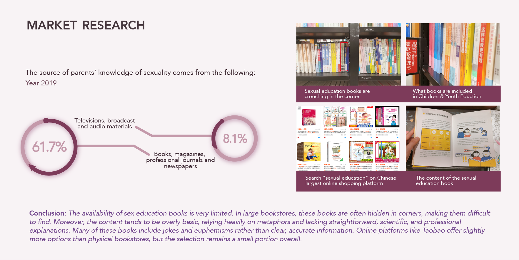
Market Research
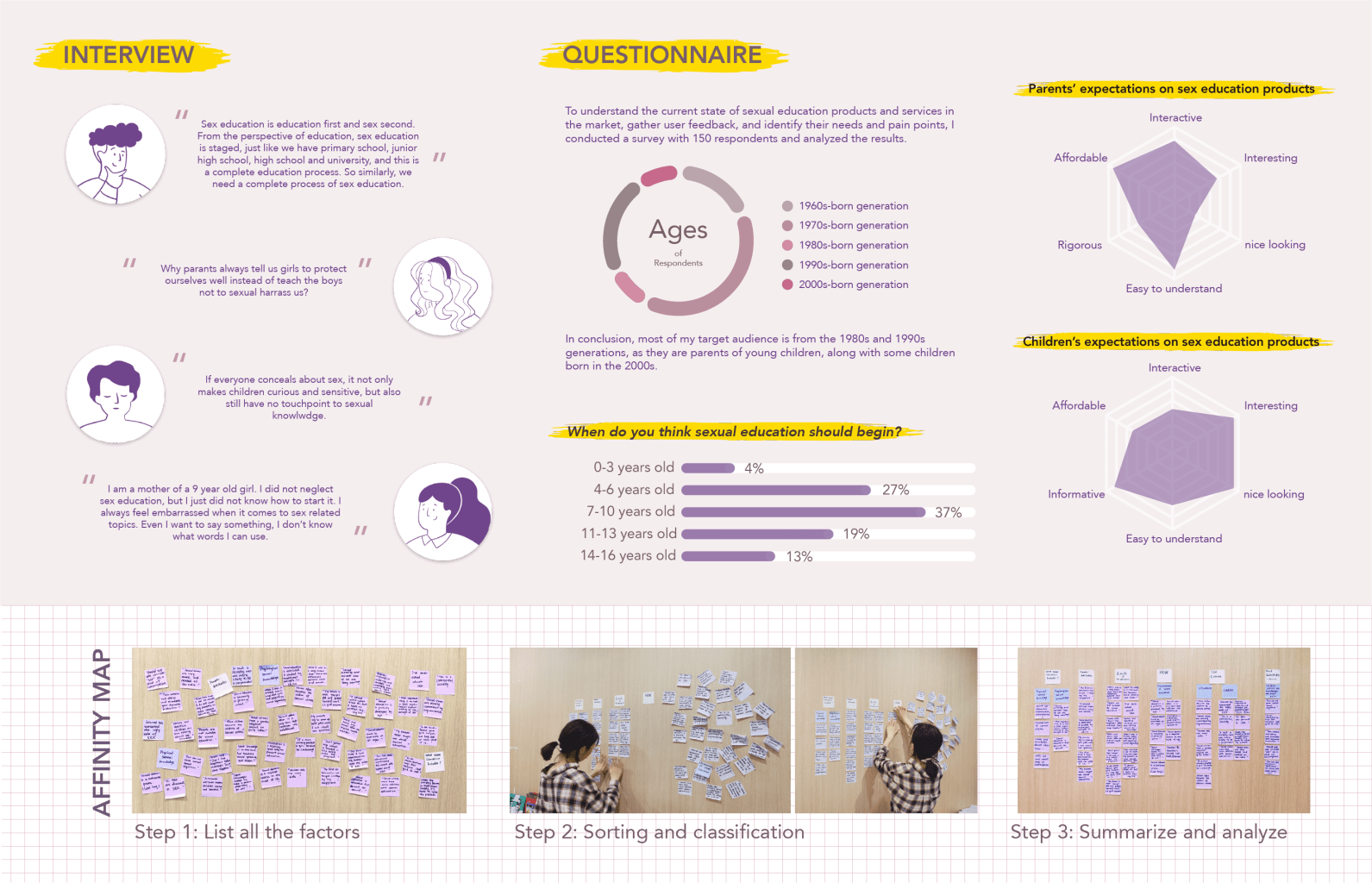
User Research: Gathering Insights
To delve deeper into the needs and pain points of my target audience, I conducted user research through interviews and questionnaires with 150 respondents:
- Interviews: Parents shared their struggles with initiating conversations about sexual education, citing embarrassment, lack of resources, and uncertainty about how to explain sensitive topics.
- Questionnaire Results: Insights revealed that the majority of parents are from the 1980s and 1990s generations, making them the key audience for sexual education tools. Respondents also indicated that sexual education should begin at an early age (4-6 years) but lacked clarity on how to start.
From Research to Insights: Key Findings
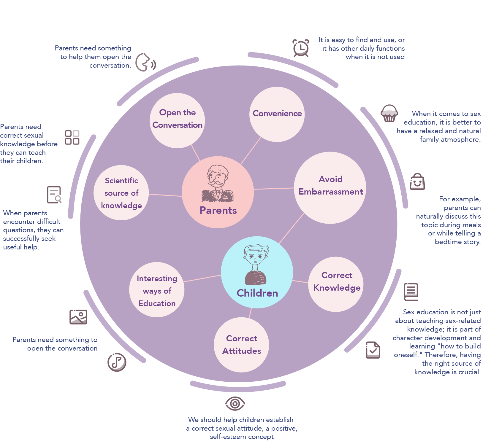
Based on the research, I identified several key insights:
- Parents Need Support: Many parents feel ill-equipped to address sexual education and need tools to open conversations naturally and confidently.
- Importance of Accessibility: Products should be easy to find, intuitive to use, and integrated into everyday family activities.
- Children’s Needs: The solution should focus on helping children establish a positive attitude toward sexuality and build their understanding in an engaging, age-appropriate manner.
Turning Insights Into Ideas
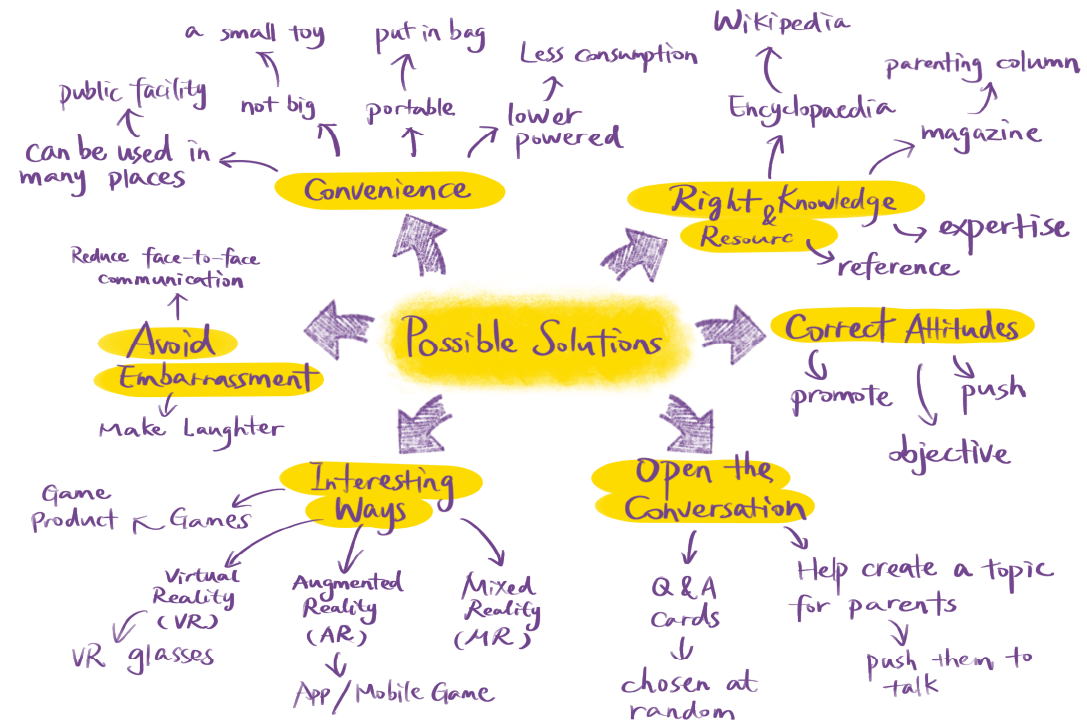
From these findings, I explored opportunities for design:
- Interactive and Inclusive Solutions: Creating a product that combines education with play to make learning enjoyable for children while guiding parents through the process.
- Integrated Tools: Pairing a physical product (like a game) with a digital app to provide flexible learning methods for families.
- Breaking Barriers: Designing resources that fit naturally into family routines, such as storytelling or mealtime discussions, to avoid feelings of embarrassment or taboo.
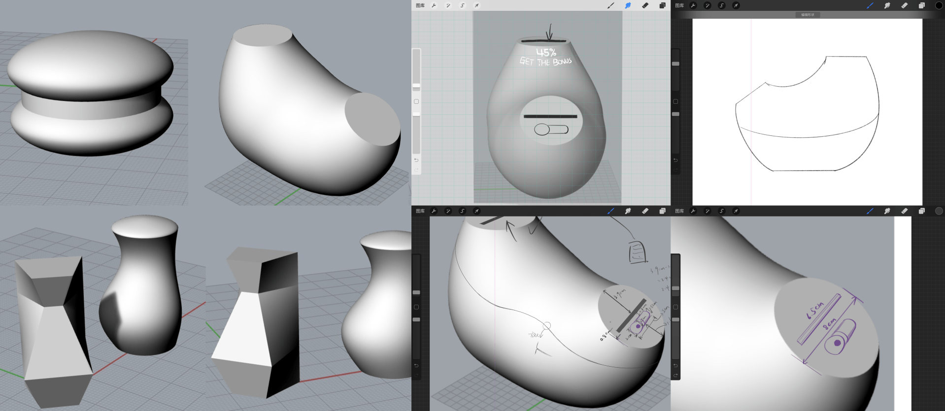
Start the Design:
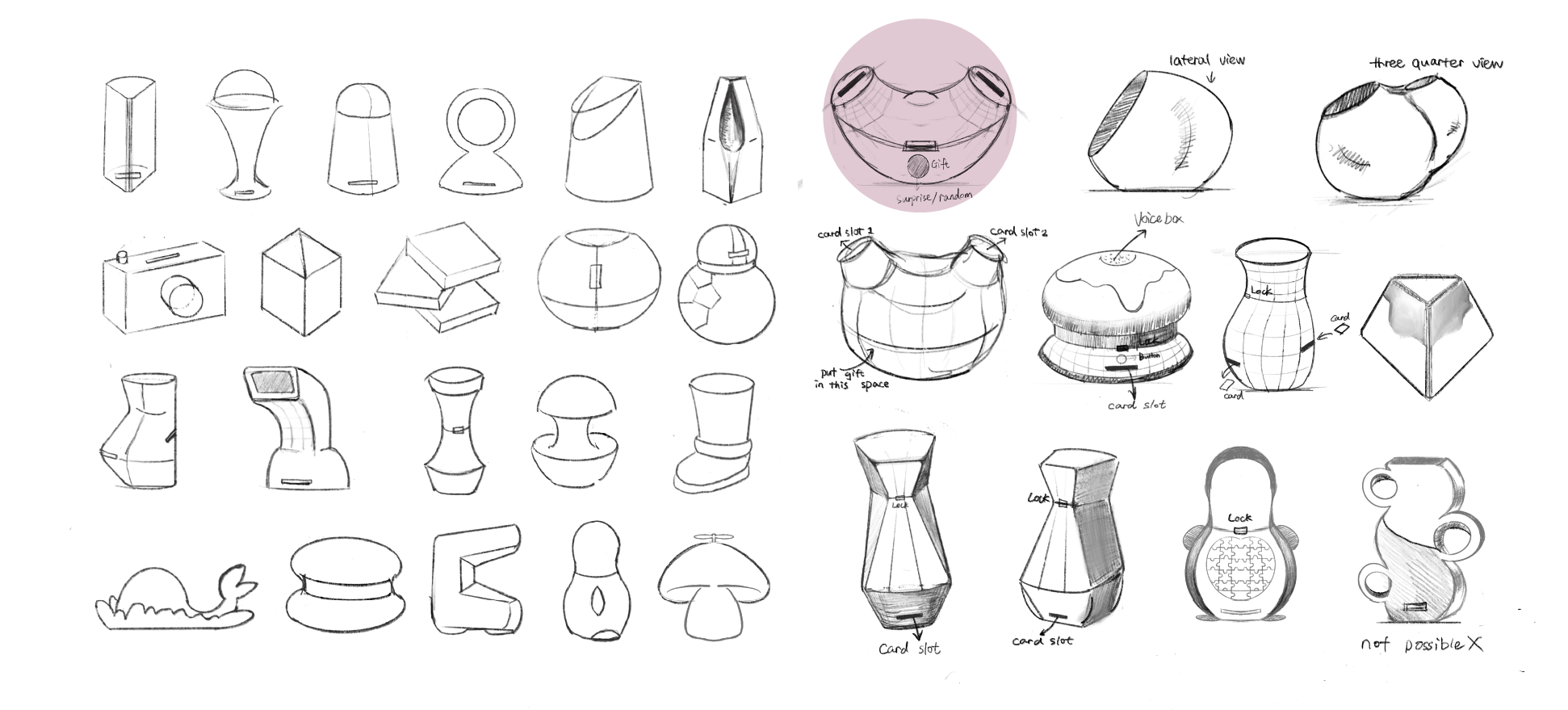
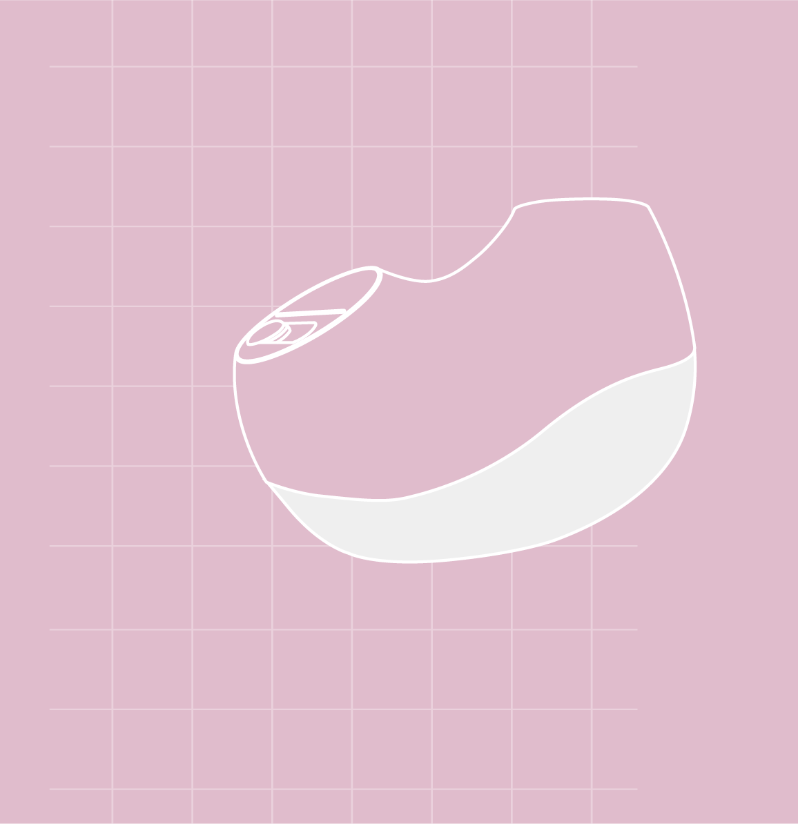
I began sketching ideas for the product’s design, exploring various shapes and concepts. The final design I chose resembles the shape of a woman’s womb, with smooth, curved surfaces. My goal was to make the design both interesting and educational, as the womb symbolizes the beginning of life. This balance creates an engaging tool for parents and children, making it easier to initiate conversations about sex education.
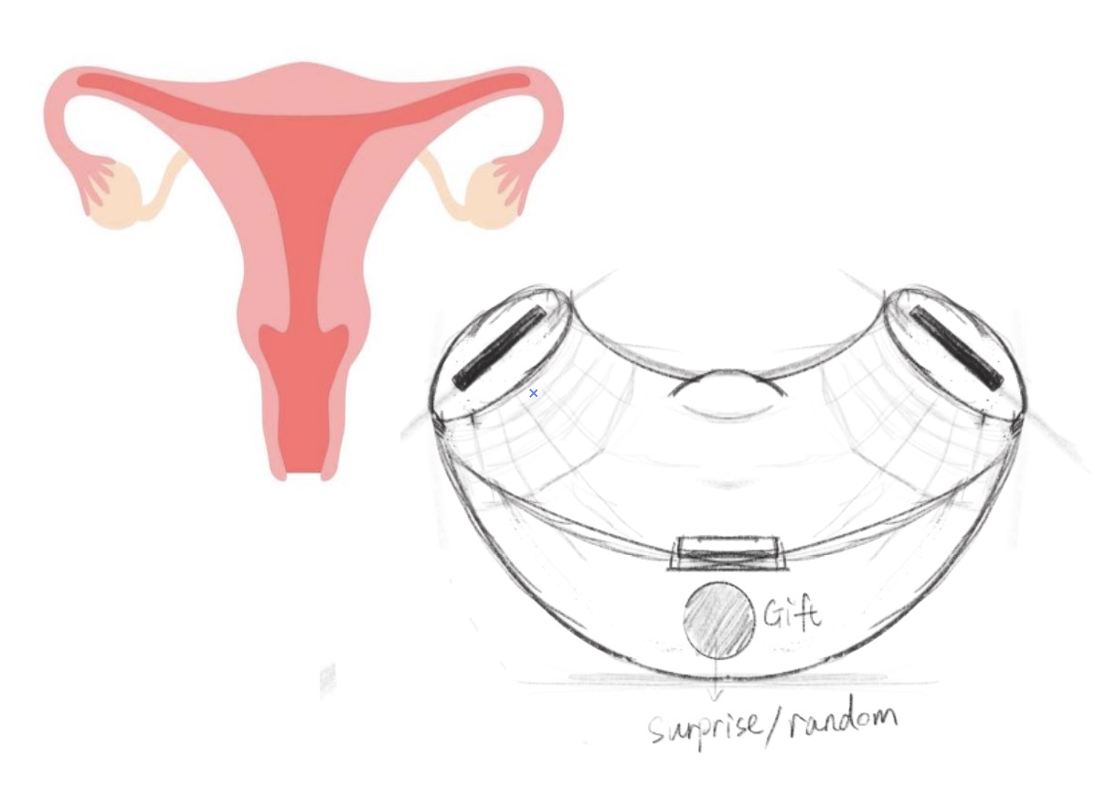
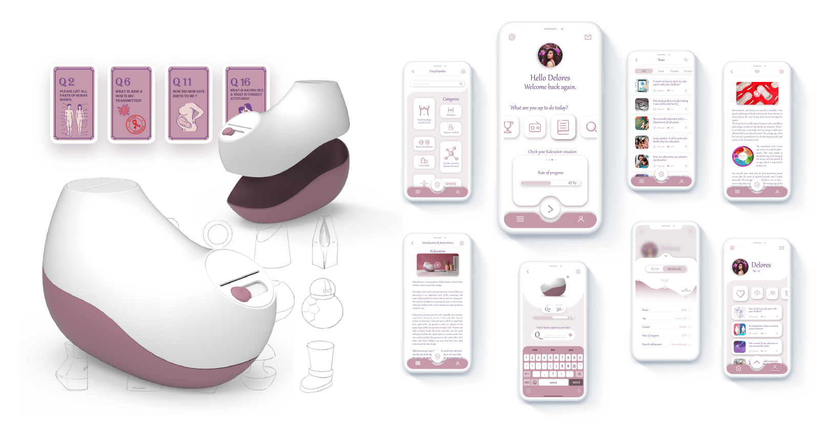
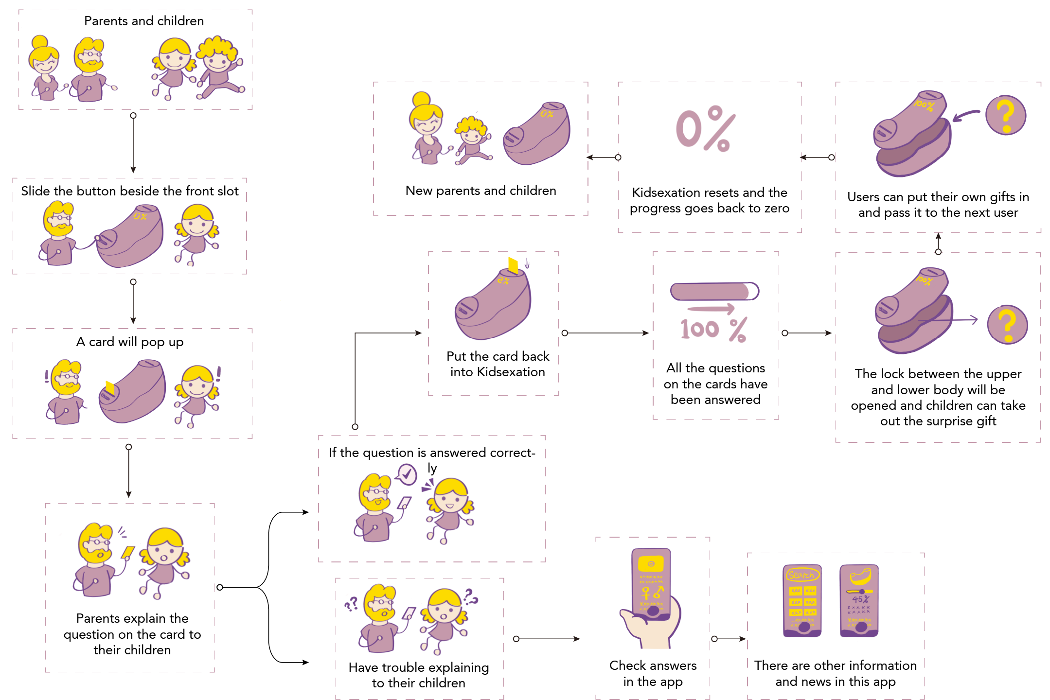
To align with the target audience’s expectations of creating a product that is interactive, fun, and educational for both parents and children, we designed it as a toy box combined with card games. The product includes question cards featuring topics related to sexual education, such as “What is HIV/AIDS?” or “Where do we come from?”
The gameplay adds structure and goals: parents and children work together to answer all the questions on the cards. Once all the questions are completed, the toy box unlocks, and they receive a bonus gift. If the questions remain unfinished, the box stays locked, encouraging continued learning and interaction.
Product Design Details:
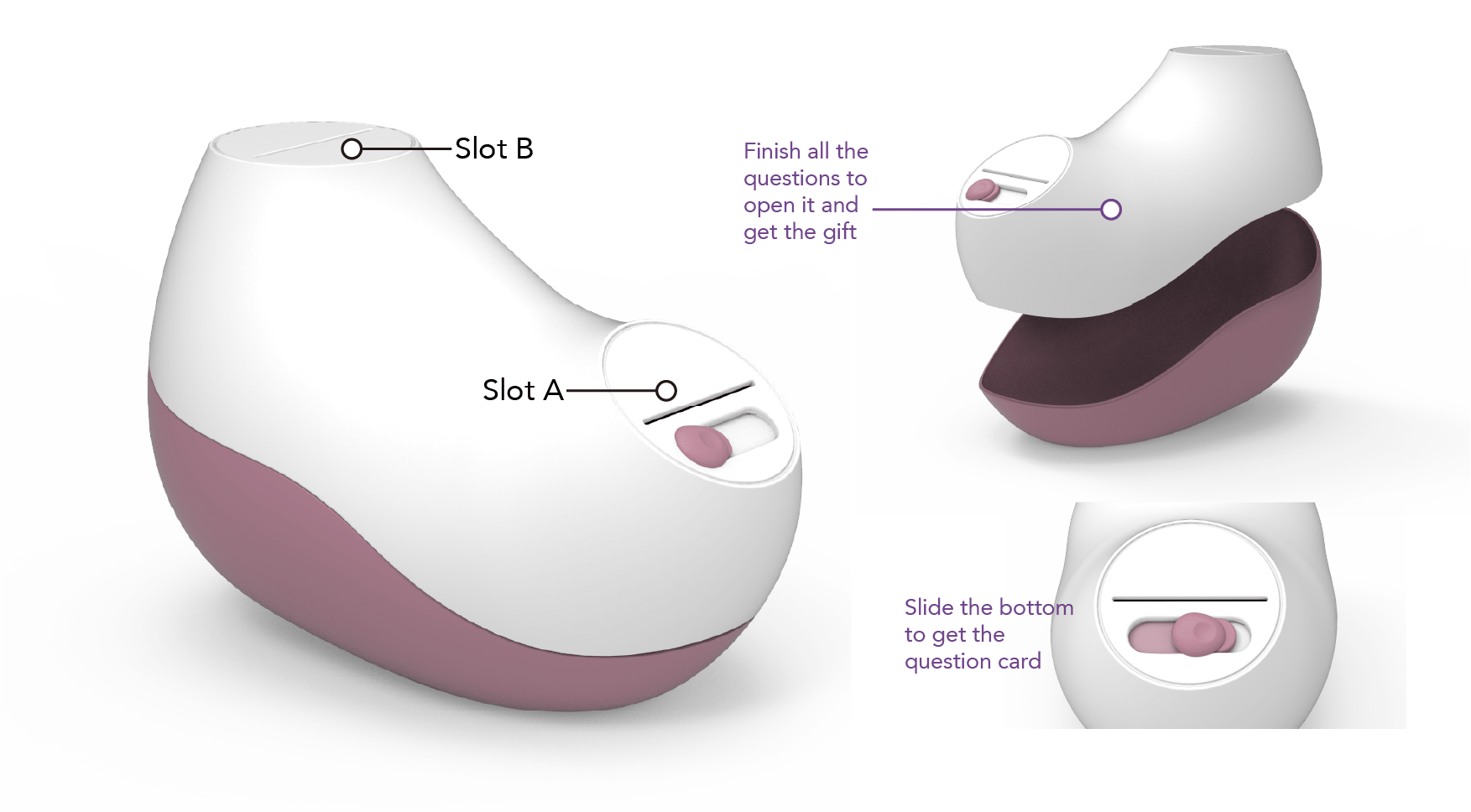
The product is designed with two layers: an upper layer and a lower layer.
- Upper Layer: This holds the question cards, which guide the educational experience.
- Lower Layer: This contains the surprise bonus gift, which can only be accessed once all tasks are completed.
How it Works:
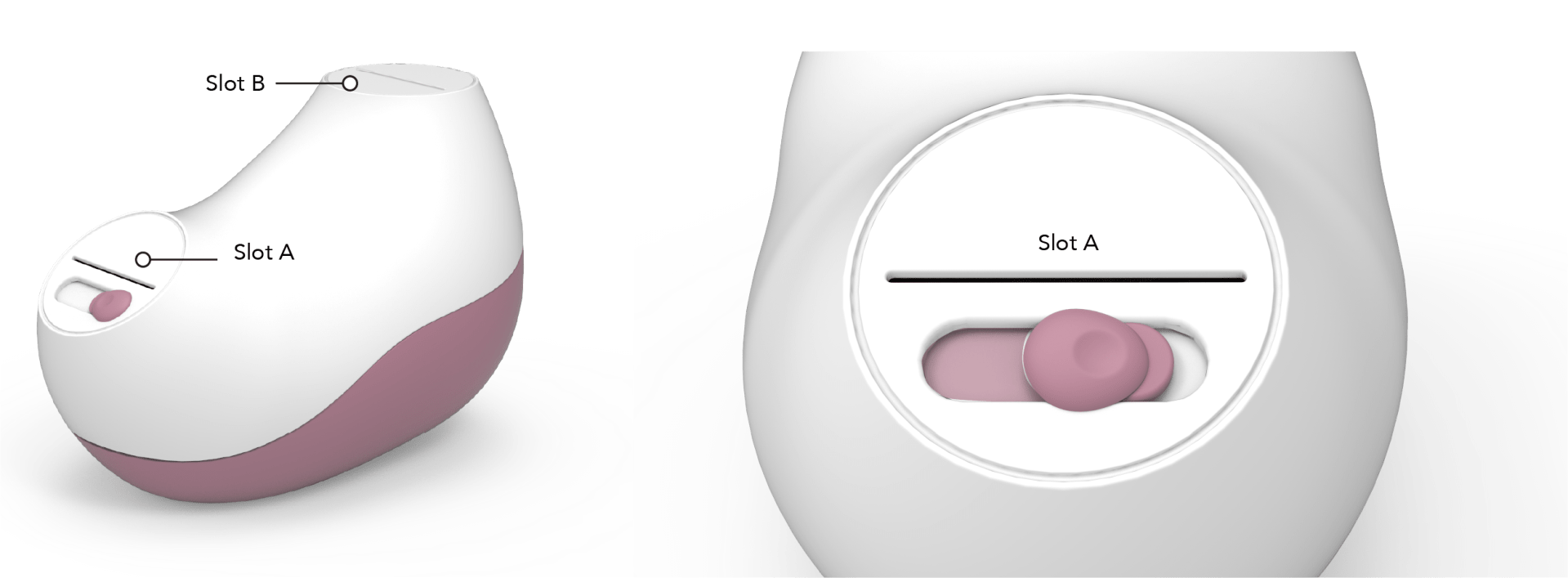
- Card Retrieval:
- By sliding the switch button next to Slot A, one question card pops up.
- Cards are released in a linear sequence, designed to progressively match the child’s age and development. This ensures the questions build on each other, creating a gradual learning experience.
- Interactive Learning:
- Parents and children work together to answer the question on the card. Once the question is solved and the child understands the concept, the card is returned to Slot B.
- Progress Tracking:
- When the card is inserted into Slot B, the product detects its return and marks the progress. This ensures that every question is addressed before moving to the next step.
- Unlocking the Gift:
- Once all the cards are completed and returned to Slot B, the system unlocks the lower layer.
- The toy box can then be opened to reveal the surprise gift, completing the learning cycle.
This design creates a sustainable loop.
After a family receives the bonus gift, they can place a new gift in the lower layer and pass the toy box on to another family, such as a friend’s family. This promotes reuse and minimizes waste, aligning with sustainability principles. Additionally, it fosters stronger connections and friendships between families, making the experience not only educational and surprising but also delightful and meaningful for everyone involved.
Question Cards Design:
When it comes to the content on the question cards, the goal is to help parents open the conversation in a professional yet approachable way. The questions are designed to be straightforward and also follow a step-by-step learning progression to match the child’s age and understanding level.
For younger children, the questions are simple and focus on foundational knowledge, such as learning about the human body and its parts. As children grow older and their cognitive abilities develop, the questions become more advanced, covering deeper and more professional topics. This progression helps children gradually build a comprehensive and well-rounded understanding of sexual education.
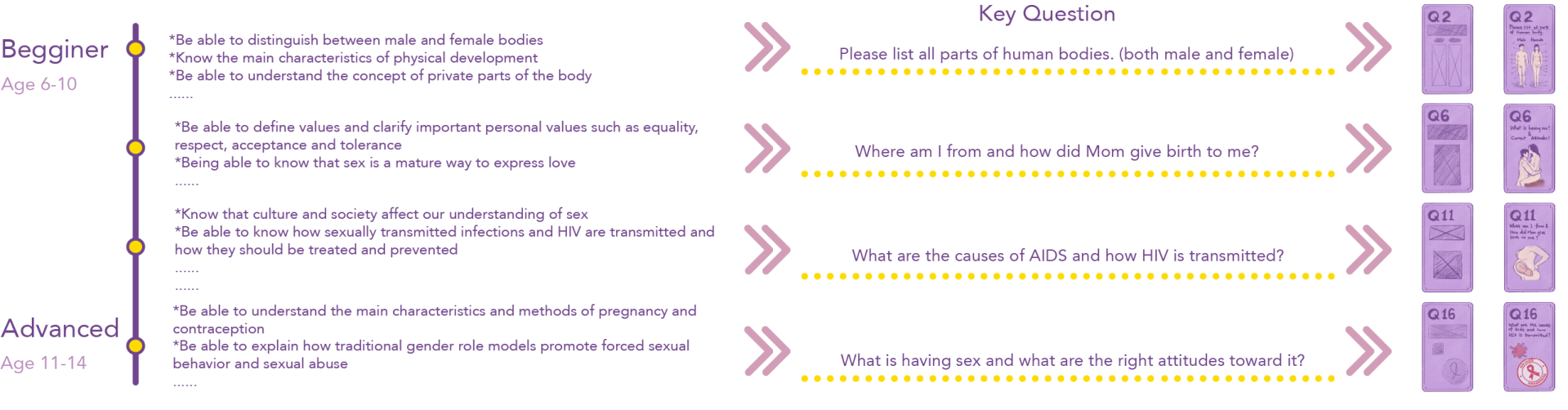
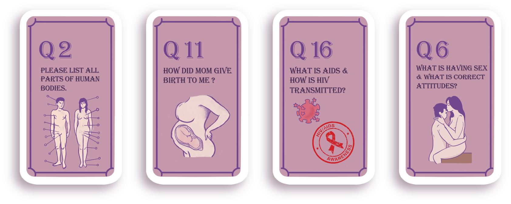
Question Cards Design Examples:
Addressing the Final Challenge: When Parents Don’t Know the Answers Either
In East Asian cultures, where traditional values often make discussing sexual topics taboo, many parents lack professional sexual knowledge themselves. This is due to a generational gap in education—many parents grew up without proper sexual education, as it was neither taught at home nor included in their school curriculum. This creates a challenge: if parents don’t know the answers, how can they effectively teach their children?
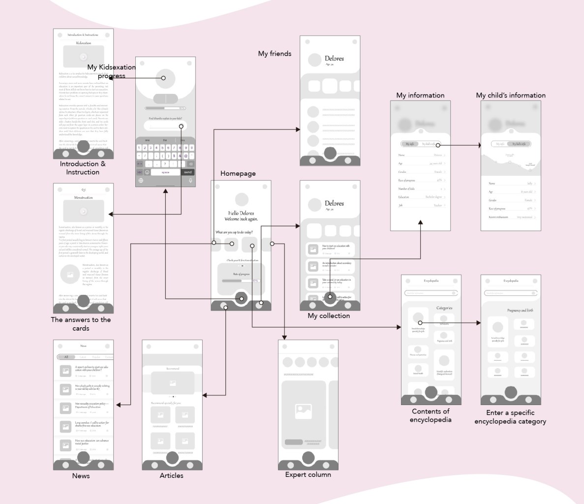
The Solution: An Accompanied Mobile App
To address this, I designed a companion mobile app linked to the toy box. This app empowers parents by providing resources and guidance in the following ways:- Answer Lookup: Parents can use the app to check answers for the question cards in advance, preparing themselves before playing with their children or even during the game.
- Progress Tracking: The app tracks the time spent on the product and logs the learning progress, giving parents insights into their child’s educational journey.
- Additional Resources: It offers related knowledge, news, and professional content to help parents become more confident and equipped to discuss sexual education topics.
- Ease of Use: The app ensures that the learning process is smooth and accessible, giving parents the tools they need to create a positive and informed experience for their children.
This solution not only bridges the knowledge gap for parents but also helps foster a more open and confident approach to sexual education within families.
High-fidelity Mock-up and Design System:
User Flow:
Sample Use Scene:

Reflection on the Project:
As a designer, this project was both a challenge and an opportunity to address a broad yet abstract issue—breaking the silence around sexual education in East Asian societies. The process required balancing sensitivity with practicality while designing a product that fosters communication and learning within families.
Key Design Challenges:
One of the most significant hurdles was addressing the generational knowledge gap. Many parents, influenced by traditional values, lack the knowledge or confidence to talk about sexual education. Designing a solution that not only engages children but also supports parents in their learning process was critical. This led to the development of a companion mobile app, which became a cornerstone of the design. It taught me the importance of extending a product’s usability beyond its physical form to a digital ecosystem that enhances the overall experience.What I Learned:
- Human-Centered Design: This project reinforced the importance of deeply understanding the needs of both primary (children) and secondary (parents) users. It also highlighted the necessity of designing for empathy, especially when tackling sensitive topics.
- Designing for Education: Creating an engaging, age-appropriate learning progression was a valuable exercise in tailoring content to different cognitive levels. The structured approach, where questions scale with a child’s development, emphasized how design can make complex topics accessible and digestible.
- Sustainability in Design: Incorporating the concept of reuse and encouraging families to pass on the toy box highlighted how thoughtful design can reduce waste while building community connections.
- Bridging Cultural Gaps: This project taught me how design can act as a bridge to navigate cultural taboos. By creating a safe, interactive, and guided experience, the product helps normalize conversations around topics often considered off-limits.
Broader Perspective:
This project taught me that design is not just about creating beautiful or functional products—it is about solving real-world problems. I learned how to address user pain points while considering cultural sensitivities and how to use technology, such as the app, to enhance and complement physical products. It also underscored the role of designers in creating tools that educate, empower, and foster meaningful connections between people.Ultimately, this project deepened my understanding of how design can shape societal attitudes, improve family dynamics, and drive positive change. It has inspired me to continue exploring how thoughtful, human-centered design can make a difference in people’s lives.
Thank you for reading all the way through! I truly appreciate your patience and time. 🙂
-
Contact Me
-
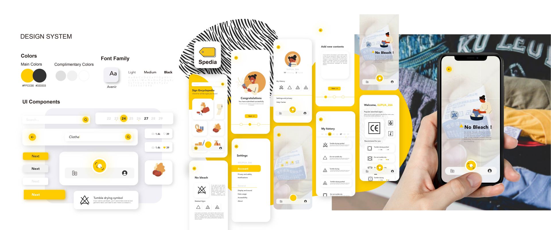
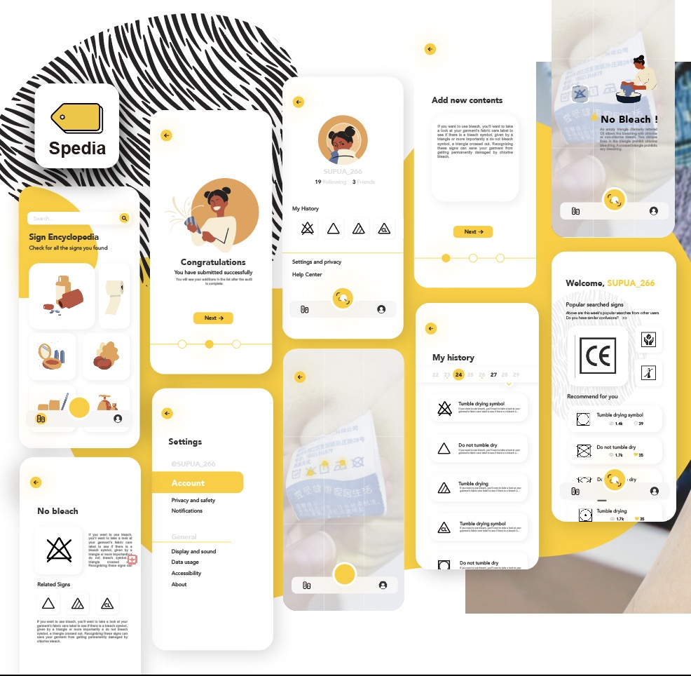
Spedia: AR Sign Identifier App
Spedia: AR Sign Identifier App
Project time: June 2021 – July 2021 (Duration: 40 Days, 3 hours/day)
Individual project: All tasks are done by myself
Keywords: App design, Design system, UX research, Augmented reality
Problem define:
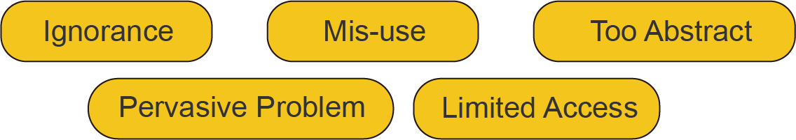
Despite the global presence and importance of signs in daily life, many people struggle to recognize or understand them. The pictorial nature of signs makes it challenging to retrieve relevant information, leading to potential confusion and inconvenience.

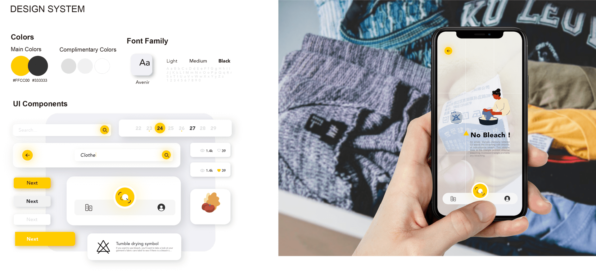
To address this issue, I designed an augmented reality (AR) mobile app that uses image scanning technology to identify signs and provide users with detailed information, including fun facts and historical insights.
History of the Signs:
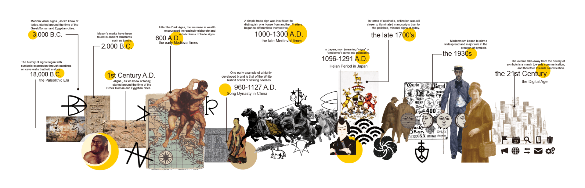
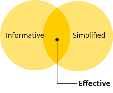
Research Background: Signs are an integral part of human communication, subtly influencing our interactions and behaviors. They are often designed to be informative and simplified, making them effective at conveying messages.
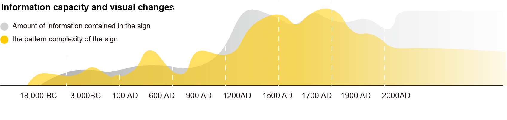
However, due to their graphical rather than textual nature, understanding signs can be difficult. This gap in comprehension inspired me to explore solutions that leverage modern technology to enhance recognition and learning.
User Research and Experiment: To validate the need for this app, I conducted a user research study involving four groups, each with eight participants. The study followed these key steps
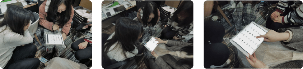
Pre-Experiment Survey: Participants were asked to self-assess their familiarity with signs by answering the question: “How often do you encounter situations where you cannot understand signs?”

Identification Task: Participants were given a set of signs to identify using any method they preferred. This phase tested their ability to retrieve sign information without assistance.
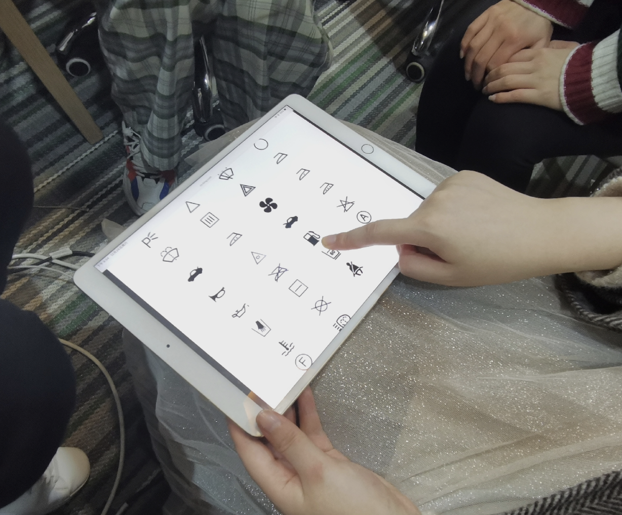
Post-Experiment Feedback: The same question from the pre-experiment survey was posed to gauge changes in confidence and familiarity. Additional questions included:
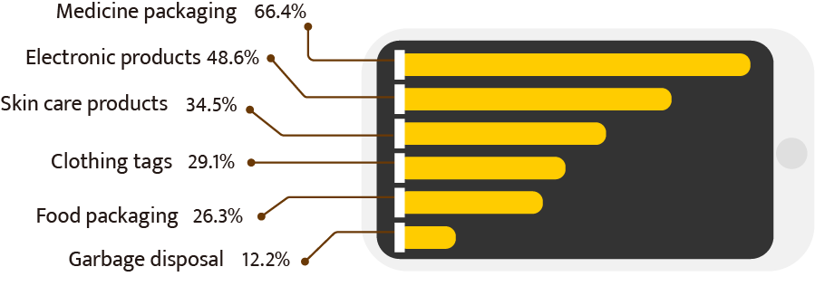
- Which types of signs cause the most confusion?
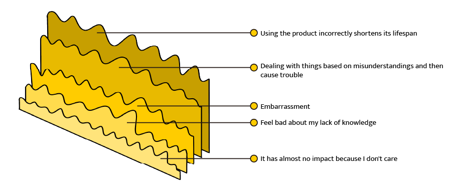
- What impact does the inability to understand signs have on your daily life?
- What do you do when you encounter a sign that you don’t recognize?

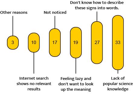
- What challenges prevent you from recognizing signs?
User Journey and Pain Points: Based on the research, I created a storyboard to map the user journey, highlighting when and where people typically encounter confusion. This helped define key pain points, such as:
- The lack of immediate access to sign information.
- The difficulty in identifying signs with complex or unfamiliar symbols.
Storyboard
Based on the data and user research results, I visualized a specific scenario where people urgently need help identifying signs they can’t recognize or understand.

Problem defined:
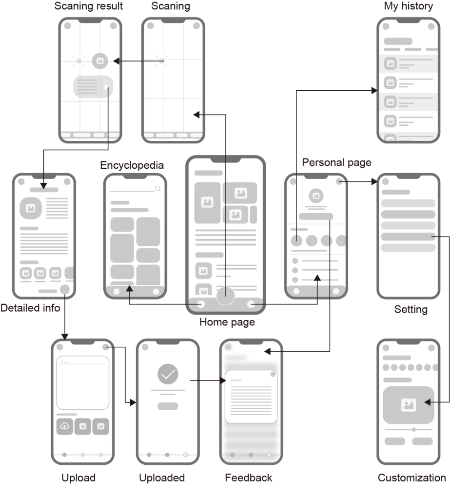
User Flow:
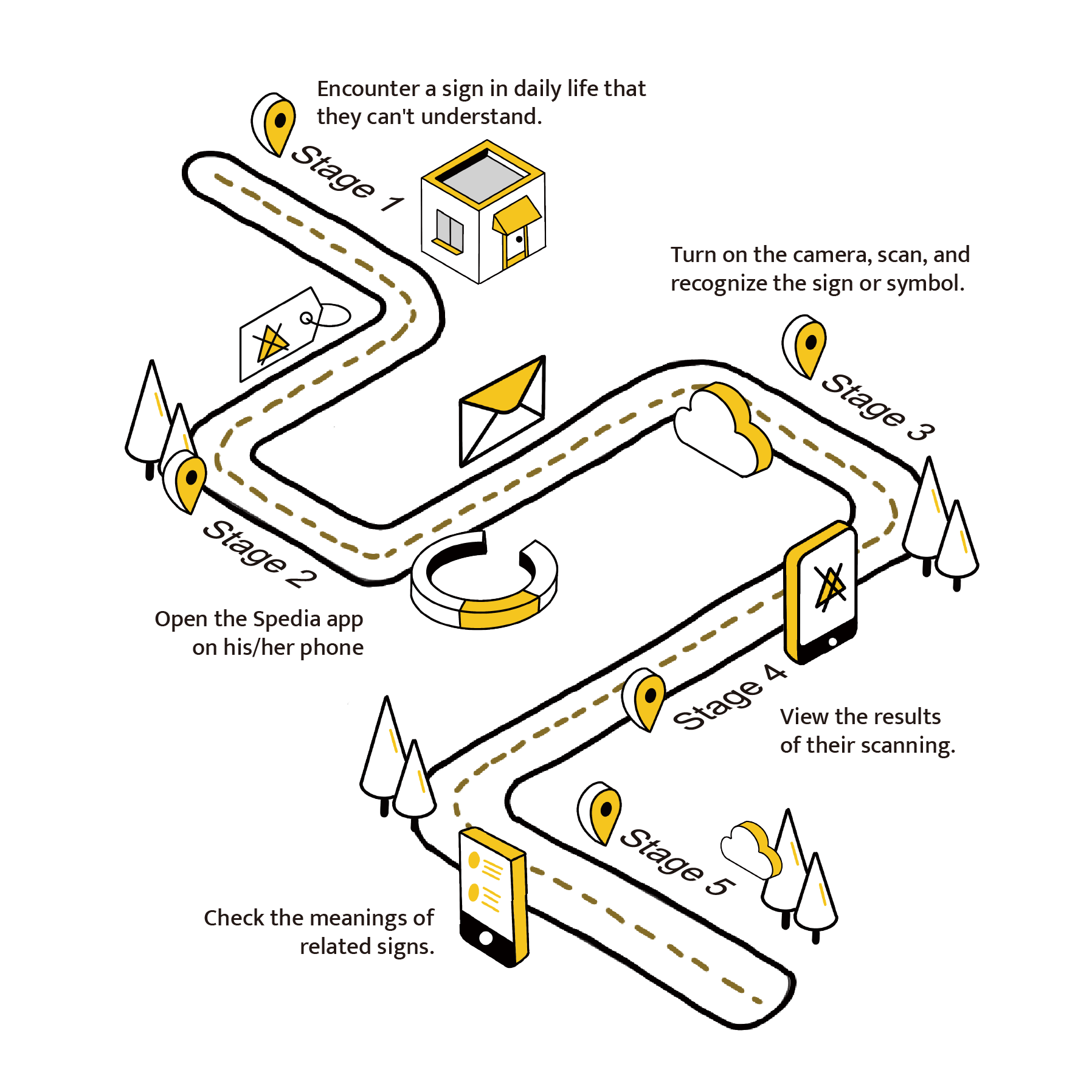
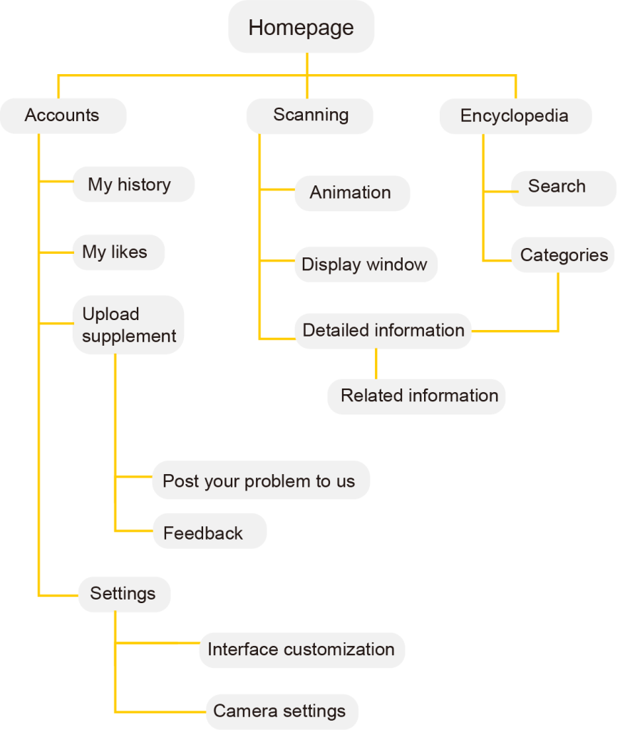
On the left is a general user flow designed to address the problem outlined above. This problem is broken down into five stages or steps.
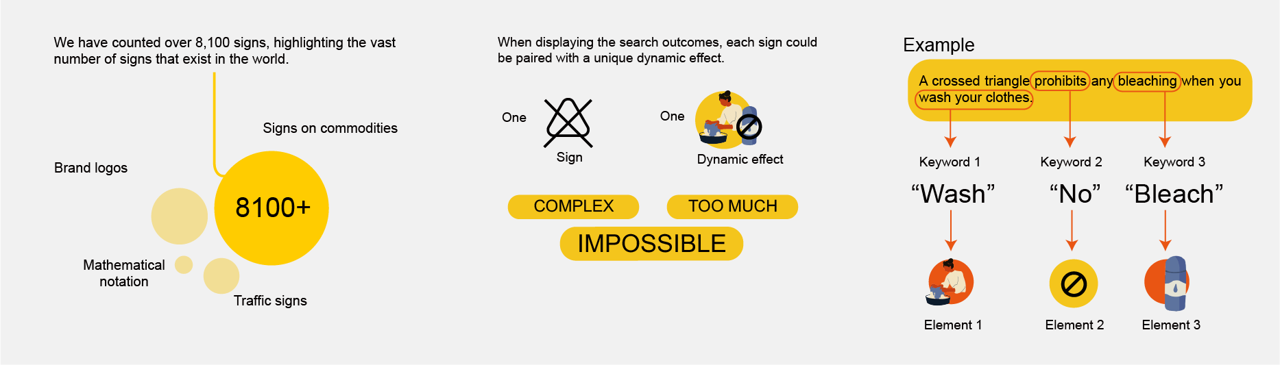
By using a mobile phone camera, users can scan signs and quickly receive answers from our comprehensive database powered by machine learning. The system ensures precision by comparing the user’s photo with existing images in the database, providing accurate matches and potential recommendations even for low-quality images.
Design and Solution: With the insights gained, I developed a user flow that demonstrated the typical process users would follow when searching for sign information.
Technical considerations and design:
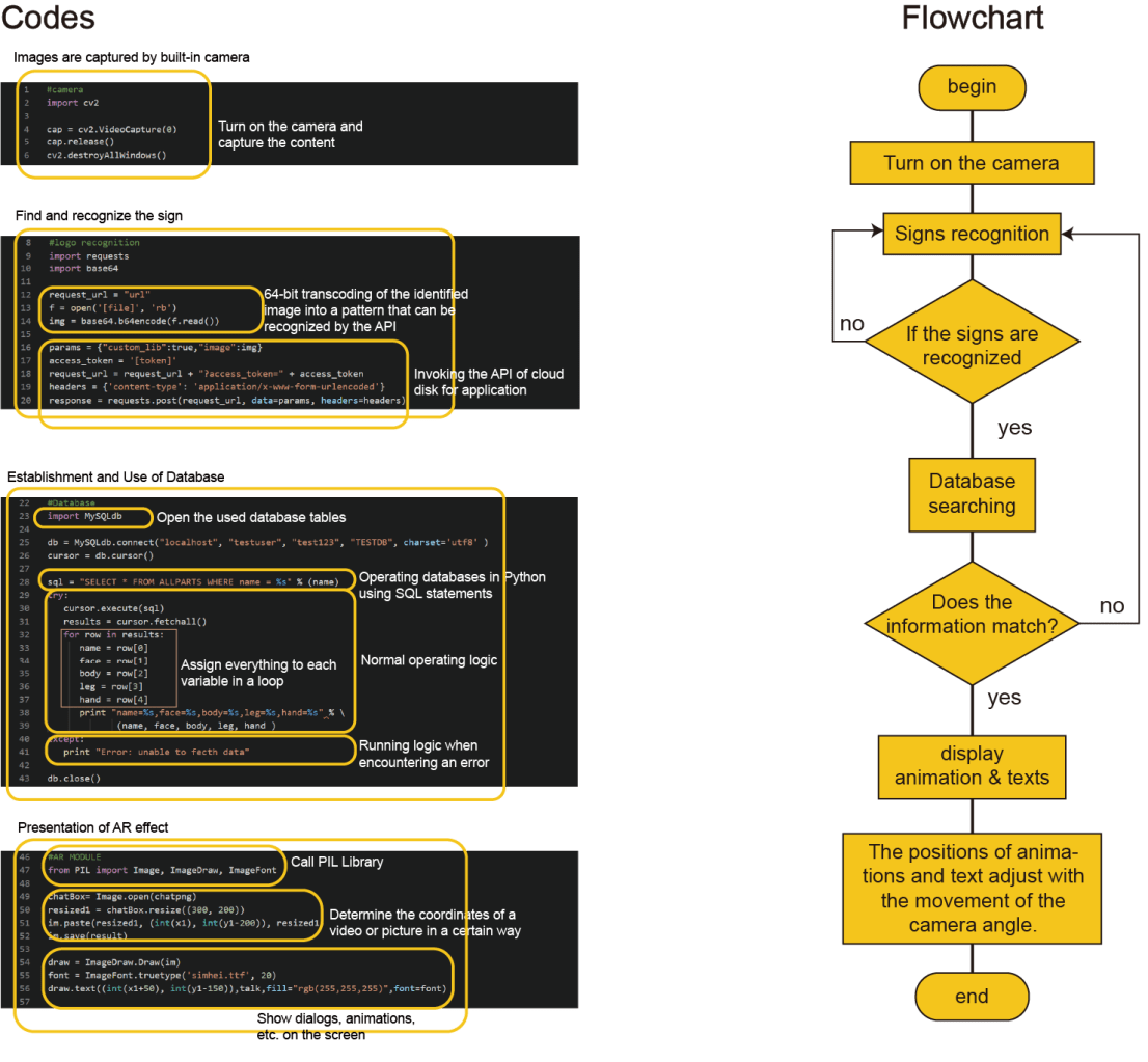
Development Process:
1. Sitemap Creation:
I outlined the necessary app pages and features to ensure comprehensive functionality.
2. Wireframing and Testing:
I created wireframes and conducted a second round of user research to verify that the proposed features met user needs.
3. Iterative Refinement:
Based on feedback, I refined the wireframes and moved to the development of the high-fidelity prototype.

Through research and experimentation, I realized that signs, while visually universal, often present language barriers. This project allowed me to create a bridge between visual symbols and their linguistic meanings, making complex information accessible across different languages. It deepened my appreciation for how thoughtful design and innovative technology can empower users and transform how they interact with their environment, fostering understanding and inclusivity.
That’s all I want to share about this project. Thank you so much!
-
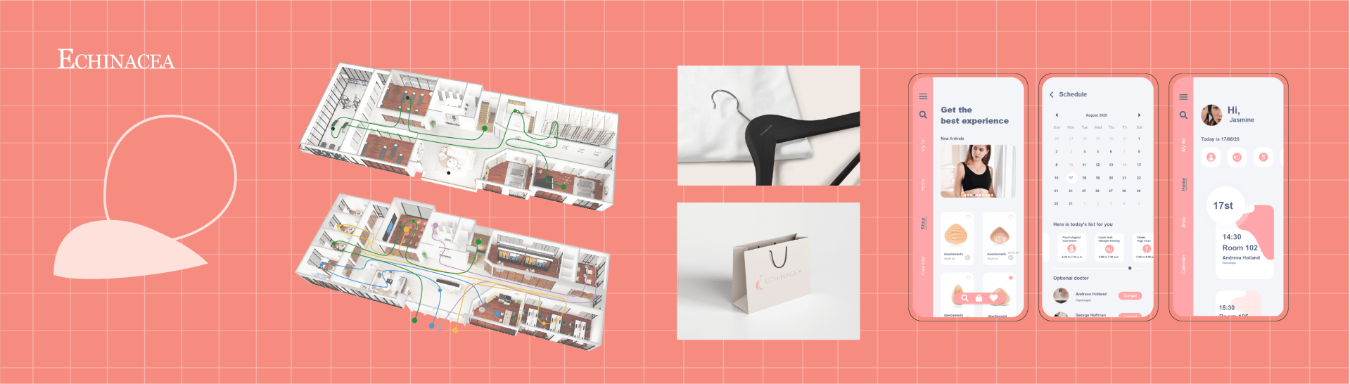
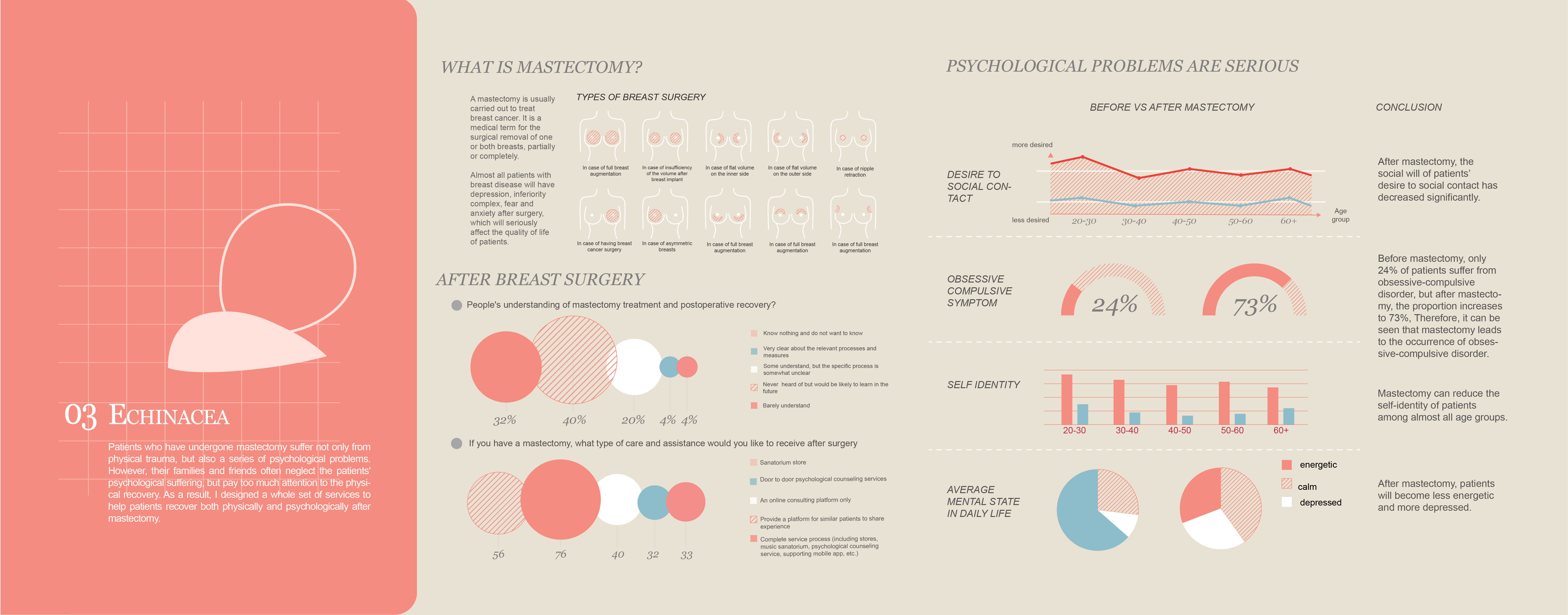
Echinacea: A Service Design for Patients after Mastectomy Surgery
Echinacea: A Service System Design for Mastectomy Patients
This actually starts with a very sad personal story of one of my Mom’s close friends: my mom’s friend underwent a mastectomy followed by breast reconstruction surgery. Although the surgery was successful, she lost half of her left breast. We congratulated her on the successful outcome, and she appeared happy and looked well. However, two months later, she tragically took her own life. This was devastating and shocking news for us.
Mastectomy, a surgical procedure for the removal of one or both breasts to treat breast cancer, impacts not only the physical well-being of patients but also their psychological and emotional health. Although physical recovery can be achieved, many patients experience profound psychological trauma, including depression, anxiety, and a diminished sense of identity.
Inspired by my Mom’s friend’s tragedy, I embarked on designing a holistic service system aimed at supporting patients post-mastectomy.
-
Mobile App Projects
1. Spedia: AR Sign Identifier App
The pictorial nature of signs makes it challenging to retrieve relevant information, leading to potential confusion and inconvenience. To address this issue, I designed an augmented reality (AR) mobile app that uses image scanning technology to identify signs and provide users with detailed information, including fun facts and historical insights.
Individual project
2. Echinacea: Mastectomy Recovering App
SeeM is an online platform where users can enjoy virtual art exhibitions from home. Instead of visiting physical museums, users can customize their own art pieces on the website, and AI generates personalized exhibitions tailored to their preferences.
My role: UI/UX Designer


3. Sex Education App
This platform is designed for B2B users (Clients include SHEIN, ANTA, etc.) to help manage their properties and assets (eg. fabrics, styles, patternmaking, etc.) efficiently.
My role: UI/UX Designer
4. My Portfolio Website
Yes! As a UI/UX designer, my portfolio website should also be clean and pretty, as containing the necessary information at the same time. I designed the information architecture, layouts, and aesthetic elements using WordPress, but I’m also skilled in Wix, Webflow, and other web-building platforms.
-
Xtension: an exploration for augmented senses
Xtension is a single-player Location-based experience with sensory augmentation devices and remote gesture control. The guests are assigned to locate and harvest fuel rods from Earth to take them back to their home, Enceladus.
Audience
16yo +
My role in this project:
- UI/UX Designer, concept artist, video editing & digital artist
- Website designer and developer
- Augmented sensory suit/clothes/fabric design
- Room/physical environment establishment, and props design
- Documentation and project archive
Backstory Setting
Earth in 2150. A catastrophic event wiped out much of humanity’s achievements on Earth. There are a few surviving colonies on different planets, including the home of the guests, Enceladus. They now face an energy crisis where a specific type of fuel rods are required to power their civilization. The power rods were only manufactured on Earth before the planet was wiped, and guests must now retrieve them from Earth.
Earth is now devoid of atmosphere, which exposes itself to massive amounts of radiation from the Sun. The fuel rods can only be located by radiation however, and therefore guests must wait until night time to be able to pinpoint their exact locations. The lack of light and sandstorms make it impossible to navigate at nighttime. This places the guests on a loop; pin the locations of the fuel rod at nighttime, and navigate towards it at daytime.
The fuel rods can be harvested from inside the vehicle through remote gesture control. The harvested fuel rods are loaded in the cargo bay, where it must be continuously maintained. The volatile nature of the fuel rods must be stabilized, which can be done through remote gesture control within the vehicle. Leak detection system alerts the guests with audio/visual feedback, and the thermal camera distributed to the guests can then detect the hotspots within the vehicle. The guest can then approach the corresponding compartment, using a remote gesture to stabilize the cargo.
Cargo stabilization requires water to constantly cool down the temperature, but the same water is also used to cool the vehicle itself. The guest therefore must carefully balance the resource usage without using more than needed to prevent the vehicle from being stranded on barren Earth.
Game Loop
-
Pokemon Match Game

This project, Pokemon Match Game, is a tile-matching game using Unity3D and C#. It covers most of the basic features of this genre. The gameplay is similar to other popular match-3 games: players match three identical items (in this game, Pokémon Assets) in a straight line to eliminate them.
Component Descriptions:
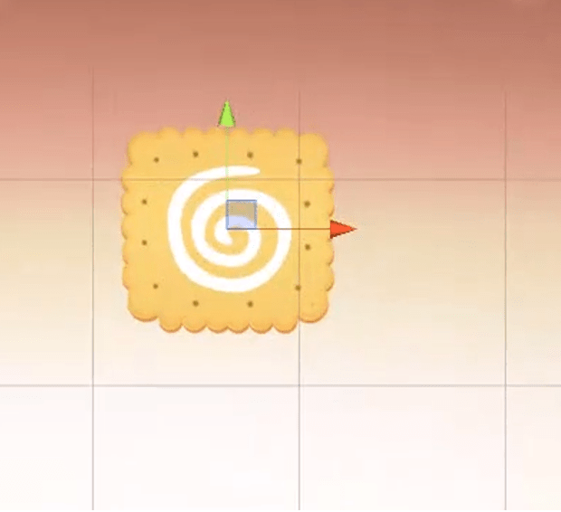
- Biscuits: Biscuits block other Pokémon from falling (updating). If any group around them is eliminated, the biscuits will also be cleared.
- Rainbow Candy: Rainbow Candy appears randomly. When swapped with any adjacent Pokémon, all Pokémon of that type on the screen, along with the Rainbow Candy, will be eliminated.
- Shaking Pokémon: If eliminated by a horizontal move, all Pokémon in that row will be cleared; if eliminated by a vertical move, all Pokémon in that column will be cleared.
- Restart: Restarts the game.
- Enter: Launches the game’s start screen (animated sequence).
Team Contributions:
- Yilin Zhu (Me): Team leads; Empty object generation; core algorithm: filling (movement, diagonal matching); drag-and-swap functionality; line matching, UI design and icon drawing; UI implementation into Unity 3D.
- Lehan Zhou: Background and prefab creation; grid position adjustments; object placement, movement, and diversification.
- Wenjie Chen: L-shaped matching; elimination (match, entire rows/columns, same type); score and countdown control.
Solutions:
Components Used in the Project (Since we are using Unity, I will list the components I am responsible for, including animation components, algorithm analysis, and UI creation, along with their initial property settings, adopted algorithms, methods, etc.)
Empty Block Prefab Component: In the game, Pokémon elements cannot fill the entire interface right from the start; they should fall from the top to the bottom. If there are eliminations at the beginning of our game, these empty spaces will intelligently auto-complete. The idea here is: We should create an empty block called ’empty’, defined previously as an enumeration type, to act as a signaling molecule. Then, we convey this information to other sprite elements that there is now a space available for filling.
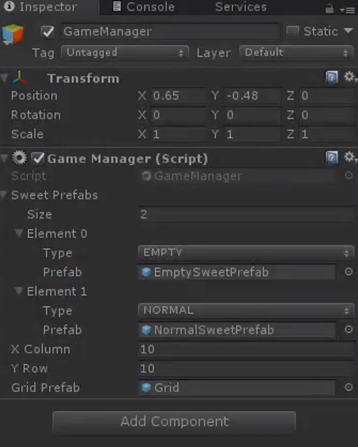
This way, the ordinary sprite elements will fill that position. Therefore, we create a block ’empty’ to serve as a method for generating sprites. (For the creation process, see the code analysis section)
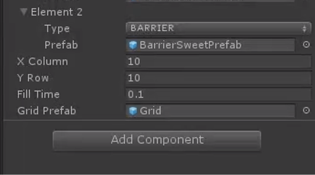
Then, we call this method, at which point empty blocks will fill the screen. We then pass a few parameters into this method and click ‘run’ once the game interface is filled. Below in Unity, set the properties as follows: Add a second element ‘element0’ in the gameManager, whose type is EMPTY, with properties (including dimensions) as shown in the diagram below:
Obstacle Creation: Properties of the obstacles:
Core Algorithm Section: Firstly, I will provide an overview and explanation of the core algorithm. We traverse from the bottom upwards, meaning each traversal starts with the elements at the bottom and we assess whether the current element can move. If it can, it executes the operations. Thus, we traverse from the bottom up. The very last row does not need to be traversed because each fill requires checking whether the sprite in the current cell can move, without having to traverse all game items every time. The last row is at the bottom layer and will not move down any further. Next, let’s look at the penultimate row; each time we traverse to each element, like the one in the image, we determine whether it is a movable sprite.
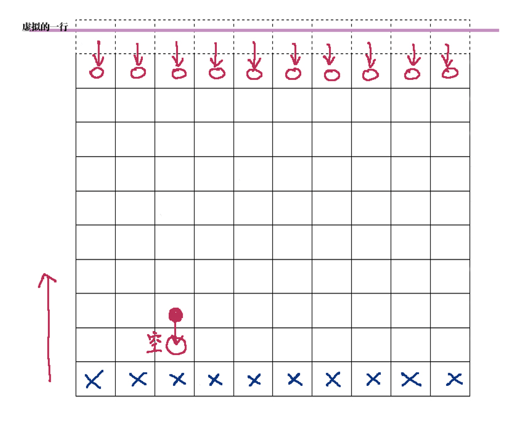
Currently, without many complex types, we classify them into two types: empty sprites and non-empty sprites. If it is a non-empty sprite, meaning it can move, then the next step is to traverse the position directly below it. If it is an empty sprite, then the ordinary non-empty sprites should sequentially move down. At this point, its original position becomes empty, and then we generate a new dessert there. This method continues with sequential traversal, moving down, and filling—this forms the core idea of our core algorithm. For the topmost row, which is special because if it is empty, we cannot fill it as there is nothing above to fill from. At this point, an idea arises: we create a hypothetical row (represented by a dashed line in the diagram), which is at the very top. We let it generate elements each time we finish editing, and when we traverse to the lowest row, we first check if the current cell is empty, if it is, then the row directly above should fill downwards.
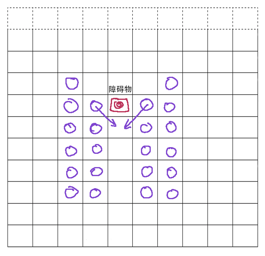
This is our core algorithm and central idea. We divide this algorithm into two steps for writing: one part involves complete filling, and the other part involves partial filling. Complete filling is considered a major action, and each instance of partial filling is considered a small step. Therefore, the first method we need is a complete filling method, then further refined into distributed filling. Filling is further divided, including vertical filling (vertical direction) and diagonal filling developed due to the presence of obstacles.
-
Agents of Influence
My role in this project:
- Attending Art Team and UI/UX breakout meetings.
- Contributing ideas, taking notes, reviewing designs and art as needed.
- A primary responsibility for:
- Game UI/UX (including tutorials)
- Teacher Dashboard UI/UX
- SPAM system UI/UX
- Assuming a shared primary responsibility for:
- Developing overall UI/UX style guide
- Assuming a secondary responsibility for:
- Website UI/UX
- Accessibility features
- User Research Sessions
- Field Guide UI/UX
- Working with the Development Team, Production Team, Art Team, Sound Team, and Education Team to implement Narrative Team’s vision, create a polished, playable, commercializable Product.
- Attending Art Team and UI/UX breakout meetings.
-
Website Design Projects
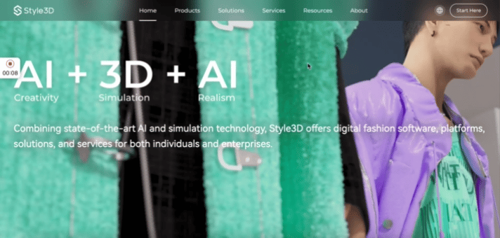
1. Style 3D Official Website Design (2022)
During my full-time internship at my previous company, Style 3D, I was responsible for this project. You can view it at the following website link: https://www.linctex.com/
My role: Project Coordinator, UI/UX Designer
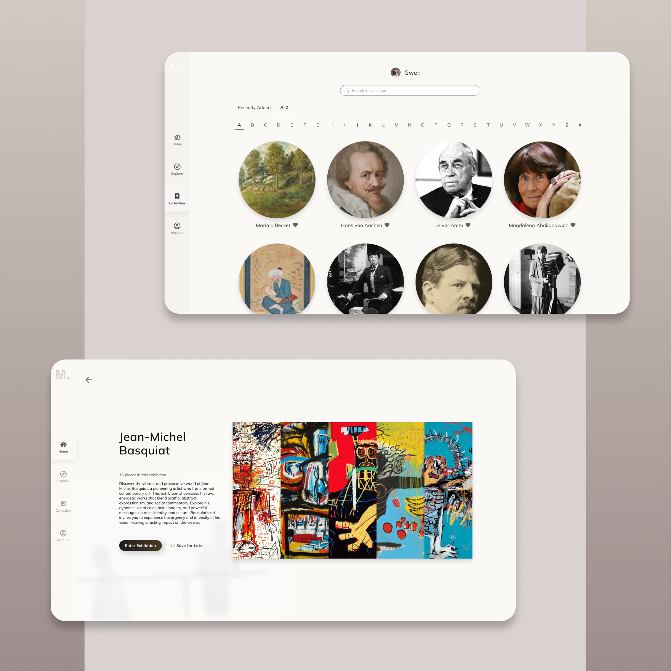
2. SeeM: An Online Art Exhibition Platform (2024)
SeeM is an online platform where users can enjoy virtual art exhibitions from home. Instead of visiting physical museums, users can customize their own art pieces on the website, and AI generates personalized exhibitions tailored to their preferences.
My role: UI/UX Designer
3. Style 3D Cloud (B2B, 2022)
This platform is designed for B2B users (Clients include SHEIN, ANTA, etc.) to help manage their properties and assets (eg. fabrics, styles, patternmaking, etc.) efficiently.
My role: UI/UX Designer
4. My Portfolio Website
Yes! As a UI/UX designer, my portfolio website should also be clean and pretty, as containing the necessary information at the same time. I designed the information architecture, layouts, and aesthetic elements using WordPress, but I’m also skilled in Wix, Webflow, and other web-building platforms.
